Showing posts with label M Project. Show all posts

Monday, January 17, 2011

The M Project: finding inspiration from other bloggers

I love Good Bones Great Pieces.  They have a fresh take on all of the current design trends and a way of making what could be trendy timeless.  I also love that every so often they'll throw in something on fashion or entertaining, but still keep the focus on design.  The combination is great for providing inspiration.

And they just did a post that relates so much to the M Project - what to do with a big, black leather couch.  They were asked for advice on how to recover two chairs to go with as well as detract from the couch.  M & J don't have existing chairs, but are open to the idea of getting a new chair or two so this could be good inspiration for them.

I really like GBGP's second option for my project:


Since they don't have chairs to recover, I went to La-Z-Boy to see if I could find something there.  J likes his current reclining chair, but it's just too big for the space.  I want something a little sleek, but still super comfortable.  The Riley fits the bill nicely.  There are over 1,000 fabrics available (including some really great prints), but keeping with GBGP's idea, I went with Linato/C949462.


It's a nice taupe that should blend nicely with the black couch and also with the blue/gray they're thinking about for the walls. It's a shade that would go with a lot of different options for their future house and also be easy to decorate around for their current one.  Plus it will look nice with the trunk coffee table.

Hmmmm - I'm starting to see pillows dancing in my head...

Thursday, January 13, 2011

The M Project: working with what you have

Since M & J do plan on buying a bigger house in the near future, they've decided against buying a new couch.  Totally get this.  Couches are a big purchase and often are very specific to a space.  A sleek little sectional might be way undersized in a new-development house.  Or may block passage to the living room in a 60's rancher.

They do want to update the coffee table, window treatment, TV stand - all the accessories that can more easily be repurposed either in the future living room or some other room in the house.  So that's what we're going to focus on now.

I just came across this living room on Houzz:

Selected Projects eclectic living room
eclectic living room design by new york interior designer Interiors by Francesca

That beige couch is practically the overstuffed fraternal twin of M & J's black couch.  But with the graphic painting and the cool lamps, you don't really notice it.  Or at least it's not the first thing your eye sees.

Now, my plan for her living room is to have the couch underneath the kitchen pass-through.  But we could jazz that wall up - maybe something hanging above the opening?  Or maybe having a really cool gallery wall on the long wall will help redirect the eye.  Also, if the kitchen is painted a different color from the living room, that will also help draw the eye away from the black hole that is a ginormous leather couch.

I'm also on a big glass coffee table kick right now, but I think a solid or almost-solid one, like in the above picture, would be a good thing.  A visual block before you get to the couch.  Maybe a cool trunk where they could store afghans and board games. 

Hmmmm - I like this idea.  Here are a few I found at easy-to-shop places, but this could also be something hunted down at antique shops and Salvation Army. 


The first two are from Pottery Barn.  The third is from Crate & Barrel.

Thursday, December 16, 2010

The M Project: couch options

I did some searching for a good sectional and found these options:


I like this couch a lot.  I like the boxiness of it and it's really comfortable.  I've sat on it in the stores and it's cushy, but not overly huge.  The seat is high enough so you can sit and stand easily and it's not too deep. 

I would pick either this great red or charcoal velvet.  The red is bright and fun and would be a great splash of color.  I also think that red can be used as a neutral.  But with the charcoal, then the walls could be painted a pretty blue and the curtains could be a mix of grays, blues and plums... 


This is actually the same as the Pottery Barn Square.  Since we have a Mitchell Gold store here on 14th St, it basically comes down to which one is cheaper.  When I went to MG, they had so many fabric options. 


Obviously we wouldn't get this exact set-up!  The arms on this couch are a little more graceful, though I think the cushions are a little deeper than I normally like.  Of course, maybe M & J love a deep couch?


This couch is great.  It's not too big, it's square but not as boxy as the first two.  The only problem is that it's only available to the trade - and I'm not trade.  But many designers are happy to help out with to-the-trade purchases.


These arms are even more streamlined and the legs are a little longer.  Showing furniture's legs can be good to keep a room airy, but if you have too many legs in a room, it just seems like it's all going to run away.  I think M's living room could handle a couch with or without visible legs.

The M Project: plan for the living room

I went to M's house Tuesday evening and she's right - it is a difficult space to decorate.  It's a really cute house, but small.  You walk in the house and are immediately in the living room, which is a skinny rectangle.  To the left is the powder room, a sliver of wall and then the stairs going up.  Then there's a doorway to the eat-in kitchen and a wall with an opening between the two rooms.  The kitchen is a nice size with enough space for a 6-person table.

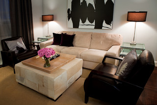
It has clearly been a bachelor pad.  The walls are still depressing builder-beige.  The ceiling fans are wicker-ish.  The faucet in the powder room requires force to fully shut it off.  The kitchen cabinets have weird porcelin hardware.  And the living room furniture is overstuffed black leather.  Cliche and a half.

I could redo everything.

* paint EVERYTHING.  All walls, all ceilings.  Banish the ugly beige, even if it's just replaced with a prettier shade of beige.
* new furniture in the living room - a sectional, a more streamlined (yet still comfy) chair, new coffee table, new TV stand (well, maybe), curtains, blinds
* storage unit in the kitchen.  New hardware for the cabinets.  (If I were really getting imaginative, I'd paint the cabinets and buy new appliances.)
* new light fixtures above the sink
* new faucets in the kitchen and powder room
* new mirror in the powder room

But the living room is the biggest issue.  It's the room you see when you first enter the house.  The current set-up has the back of the couch creating a hallway upon entry.  I totally get why they have it this way, but it's not good.  You are funnelled straight back to the kitchen or upstairs.  It's like the room doesn't want you to stay and visit.  You have to force yourself inside.

But you can't have the couch along the long wall because then there's nowhere to put the TV.  And J. said that he loves being able to watch TV while washing dishes.  I totally understand this!

What I finally ended up with was putting the couch along the short wall, under the opening to the kitchen.  Then the TV would go on the opposite wall, over in the corner.  Hang some curtains to cover the window just a bit to mask the fact that the TV would then cover part of the window. And replace the couch with a sectional.  It will give more seating for entertaining and one person can spread out on the L like it's a chaise.  Perfect for hanging out and watching movies.  Then replace the black leather chair with something like a streamlined club chair, preferably one that reclines and swivels. 

It's not perfect, but I think it will be good.  It will make the room warm and cozy and definitely more welcoming.

Wednesday, December 8, 2010

The M Project: one more gray room


This is the living and dining rooms of Alaina Kaczmarski, author of Live Creating Yourself.  Why I completely forgot about her lovely gray apartment before, I have no idea.  But she recently posted a picture that shows her living room going into her dining room and I thought it was a great piece of inspiration for the M Project since her house all flows together. 

Though for M, I think I would do a blue based rug and some purple and red throw pillows and the art would be framed in something other than white.  Not sure yet, but next week I should have a better idea because I am going to be at her house for mah jongg so will be able to get a good lay of the land, maybe move some furniture around....  I'm so excited!

Tuesday, December 7, 2010

The M Project: gallery walls

I love gallery walls.  I think they're great for filling up that big expanse above your couch or for drawing attention to a little nook.  And you don't need big, important pieces of art - small ones are great.  A mix of sizes is great.  You can be neat and orderly with similar prints in matching frames, be really eclectic with different mediums and a wide variety of frames or something in the middle.  Maybe similar frames but not exactly the same.  Not a completely random set-up, but not overly symmetrical. 

What I also love about a gallery wall is that they can evolve over time.  Maybe you only have 3-5 pictures now.  But then you're at Eastern Market and see a lovely little watercolor.  You're at Pottery Barn and they have a pretty little salad plate.  You take a pottery class and put your vase on a tiny floating shelf.  Your best friend took a gorgeous picture while the two of you are on vacation so you blow it up and have it framed.  Your grandmother hands down a silk scarf that's too threadbare to wear but still ridiculously lovely.  Eventually you end up with a wall full of special items and your gallery wall had turned into a memory wall.  What can be better than that?

Or maybe you have a few large mirrors.  Or a collection of salvaged items (or, like in one picture below, a bunch of plaster medallions).  A gallery wall doesn't have to pictures at all.

When I did mine, I found it useful to clear out everything from the middle of the room and lay out everything on the floor.  I moved the pieces around and pulled stuff from other rooms until I had a good set-up.  Then I took pictures of it all and did a rough sketch so I could remember what went where since I had to stack everything up so I could move the couch and get my ladder near the wall.

Supplies are important.  I used a laser level since I wanted certain pieces to line up - but not necessarily ones right next to each other.  A pencil with a good eraser so I could mark spots - and erase and change them.  A hammer and nails.  Picture hooks for the heavier pieces.  A ruler or measuring tape so you can space things out evenly.  I did 3" in between my pictures, but wish I had made the space only 2".  But you have to figure out what's right for your room.  Generallybetween 1-3" is good.

And patience.  Patience might be the most important supply.  Make sure you have a lot of it!  I had to rehang almost every piece 3-4 times, even with my laser level, measuring tape and gobs of pencil marks.  So frustrating, but so worth it in the end.

The M Project: gray rooms

Gray rooms can be very pretty - almost dainty - with lots of white trim and furniture and crystal accets.  But they can also be warm and eclectic.  I have to say, I like the eclectic route a lot better.  This first picture is definitely my favorite.

Houzz.com
Decor Pad
Decor Pad
Decor Pad
 Elle Decor

Find more pictures at Decor Pad and Houzz.

The M Project

So last night, one of the women I play mah jongg with asked me for help with what color to paint her house.  She just moved in with her boyfriend and is eager to make the house their home.  They're so cute together, I just love it.

We talked about going with colors that look well on you (she's a beautiful Winter - dark hair and pale skin with just a hint of olive to it with big, welcoming features so jewel tones, like royal blue, jade green, magenta, purple would all be great), or with ones that don't but that make you ridiculously happy (for her, this could be something like orange).  We talked about why I hate accent walls and that I'm anti-wallpaper borders but pro-wallpaper.  I gave her the name of a few blogs to check out and told her to start collecting pictures of rooms she likes.

I haven't seen her house, but she said that it's a townhouse and the living room is pretty open to the rest of the house so if she were to paint all walls, she'd have to also paint the stairway and a hallway or two.  And that she's planning on moving in a year or two.  Both of which made me realize that a bold color would not be right.  But maybe something like a pretty gray?  Not too dark so she wouldn't necessarily have to repaint to get it ready to sell, but not so light that it's an afterthought.  And it would be a great neutral for jewel toned pillows and art.

So I decided to put together a bunch of images that get across what's going on in my head and am going to put them in a series of posts so they're easy to send.  And thus begins the M Project!