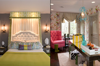
I just finished reading The Washington Post's article on this year's DC Design House and it made me think, as most things do, of Dorothy Draper.
In "Decorating is Fun!" she advises you to stay away from muddy colors. I'm sure a big part of this is a reaction to the Arts & Crafts movement, but I also think it's because clear colors are just happier. Brighter. They bring a joy to a room that a muddy color just doesn't.
Clear doesn't have to mean bright. Olive, brown, gray, terracotta - these can all be clear colors. Neutrals can be clear as well. If you can say for sure that it's white or cream or tan, it's probably clear. If you only use two shades to describe a color, it might be as well. Creamy white. Soft yellow. Blueish green. Once you get into three or more? Well, you'd have a hard time making a case for it being clear. I'd definitely listen to the argument, but a purpley-beige gray sounds pretty muddy to me.
Now, I'm not anti-muddy. I don't have any muddy colors in my house (that I know of), but I wouldn't put it past myself. I just know that when I put on a yellowish with gray undertones beige-y cream sweater, I don't look as good as one that I would call just cream. You know? And I agree with Dorothy that a house is the same way.
But if you're going to go muddy, go all the way. I know it's popular right now, but I really don't like mixing muddy and clear. It makes the muddy look dirty and the clear look out of place.
Take this dining room.
The yellow is FABULOUS. Can I please have patent leather on my dining room chairs? Pretty please? It's practical and ridiculous at the same time. But paired with the muddy beige walls? It just brings down the excitement of the yellow. Reminds me of the worst type of accent walls - where the homeowner is scared to paint all four walls in actual color so they cop out and only do one. Did the designer cop out here? I don't think so - she doesn't look like someon who would cop out on anything
But the room just feels a bit blah even with all that yellow. Maybe if the yellow had been peacock blue or purple instead I wouldn't even have thought about it. But as it is right now, it's the first thing I thought of (and the inspiration for this post).
And I get that white walls would have made the whole room overly bright and rather stark. I honestly don't know what I would have put on the walls to go wth the yellow, but it wouldn't have been this color. Probably one of the reasons I'm reluctant to decorate with yellow though I love it so much.
In the master bedroom, the actual bedroom is all clear colors. A crisp green on the bed, clear yet dark gray on the walls, lots of white accents to give everything sharp corners. But moving into the dressing room, you have clear pink and turquoise and then that muddy paint on the trim, door and curtains. Is it gray? Is it beige? Can't tell. Totally distracted by it.
Just like clear colors like other clear colors, muddy likes muddy. In the family room, the designer paired muddy walls with a muddy bench and muddy-colored art and yup, I like it. It works. I'm not distracted by anything in this room and my eye moves peacefully from one side to the other.
This bathroom - and most blue and white combos - is a great example of clear and clear. The white is a definite white. The navy offers a nice contrast. How could you not feel clean after spending some time in a room like this? I don't even mind (that much) that the shower tile is basically an accent wall. Though I think I would have liked navy on top of the beadboard. I think.
Finally, this designer used a lot of clear neutrals in her rooms. I am a bit biased - she's one of my favorite design bloggers and is totally the reason I'm attracted to browns and greens lately. But her neutrals are all definitely tan or beige. Her greens are definitely Kelly or grass. It's not an overly bright room, but it's still very cheerful and happy.
And then my favorite room? The green garden room. I mean, come on. Can I move in tomorrow? I'm sure no one would notice when I replace the dining table chairs with some of the yellow patent leather ones from the dining room, either. Or tuck one of Lauren's Mad Hatter chairs in the corner. And I'd just be in heaven.


3 comments:
What a great post! Loved your analysis!
Hope you have a beautiful weekend!
xo,
Arianna
P.S. I'm hosting a $100 e-spree giveaway on my blog in case you're interested!
i think that the issue with the design house is that all of the paints are from farrow + ball, and they don't do clear colours. they're english, and the bright clear colours aren't what looks good in the historic houses from which these paint shades are taken.
You're right - I forgot that they were all Farrow & Ball. And I think about that often because I adore F&B colors and that their palatte is so limited. I have very often decorated a pretend house in only F&B paint - and I must say, it does come out fabulously :)
But still, I would have chosen something else to go with those yellow chairs. Or something else to go with the F&B paint.
Post a Comment