I painted my spare bedroom the other weekend. I had a shade of green in my head, a little minty but softer, prettier. Similar to the color of Aerin Lauder's dressing room, but a little greener and a little prettier since I wouldn't have the floral to balance it. The name of this green was at the edge of my brain but I couldn't put it in words.
Well, Camila from High-Heeled Foot in the Door named it for me! Seafoam green. Yes! That's it! She just wrote a blog post about how it's now being considered the new neutral and I completely agree.
I really think your choices for accents are limitless. Of course white - I adore this color with large doses of white, but navy, lavender, coral, black, brown, yellow, teal.... They're all gorgeous with seafoam. To avoid looking too beachy, I would add more dramatic colors and prints. But then I think it would be so pretty and feminine but not overly sweet with loads and loads of gauzy white.
I leave for Bonnaroo tomorrow, but watch this space for updates on my seafoam spare room!
Tuesday, June 8, 2010
Wednesday, June 2, 2010
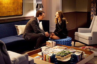
Sex and the City 2 - Carrie and Big's apartment
First, let me get it out of the way - I HATED this movie. The storyline was so shallow - not shallow like consumerism, but shallow in that the consumerism wasn't hiding some deeper meaning. What was great about the show was that sure, they were all pretty and had fabulous jobs and lives, but there was something THERE with them. And frankly, it wasn't even that pretty. I thought the four women looked a little - oh, I don't know - just wrong. Harsh. The camera angles weren't that flattering - at one point we got a close-up of Charlotte's mouth, complete with fine wrinkles all around. Considering how photoshopped the promotional posters were, I was expecting a little more post-production work on the film itself. Notsomuch.
And the clothes. I was disappointed with the clothes in the first movie, but this round they were even worse. The most creative thing was putting everyone in cocktail dresses in the middle of the day.
Though I did really like all the gold - not really Carrie's sunglasses in the opening shot, but Samantha's nails when they were in the Middle East were FAB FAB FAB. Possibly my favorite part of the movie. Kinda sad.
Instead they moved them to a dark and gloomy lower level of the same building. So maybe the original apartment wasn't available anymore. Fine, I get that. But isn't that what set designers are for?
And the reasoning was stupid - they couldn't afford the penthouse anymore so they moved to a new place. Makes sense, sure, except that later on they said that they kept Carrie's studio apartment because the housing market wasn't good for selling. So it's a good market to sell a penthouse but not a studio? More problems I had with this movie.
Anyway. I was able to find some nice, non-gloomy pictures of this apartment:
But that really isn't how the place looked to me in the theater. The whole place just seemed like a case against not having overhead lighting.
There was also too much layering of patters, too much wallpaper, too much greige. I felt like the designer was trying to prove a point that wallpaper is great, that mixing patterns can be done well, that Carrie's all grown up now. The above picture shows the fun, floral carpet, but it was never noticeable in the movie as well. It was all close-ups of the two of them in this Miss Haversham-ish space
It was dull, it was uncomfortable, it was boring and it doesn't reflect the current trends in decorating.
Hmm - maybe there is depth to this movie after all. Carrie felt like her marriage was becoming stuffy so she made her apartment stuffy as well.
Subscribe to:
Comments (Atom)


